Foreign buyers
Relocation, investment, second homes, retirement and lifestyle transitions. They need confidence in information, communication and remote neighborhood evaluation.
One consistent way to look, speak, and build. For everyone making something with Zendi.

 A single, recognizable mark.
Exact masters, clear space, background choices and small-size guidance.
Logo system →Product / 08Real buttons, neutral badges, search, forms and interaction states.
Explore components →Handoff / 12Copyable tokens, an AI-ready design brief and a brand implementation checklist.
Developer resources →For buyers, sellers, and industry professionals. That is the common goal connecting everything Zendi is doing.
Zendi is a real estate platform designed to help buyers, sellers, and real estate professionals make smarter property decisions in Medellín and Antioquia through verified listings, neighborhood-level intelligence, transparent market information, and intuitive tools to streamline the buying and selling of Colombian real estate.
Stale inventory, vague locations, inconsistent property details, disconnected communication and low-quality leads create avoidable inefficiency and distrust.
The response is higher listing standards, broader visibility, better information access and tools that help people work more effectively together.
We believe real estate markets work better when trustworthy information is easier to access, easier to understand, and easier to act on.
Better visibility, better coordination, and better market transparency lead to better outcomes for buyers, sellers, and real estate professionals alike.
Make the basis for confidence visible.
Expose sources, limitations and relevant context.
Organize around the places people actually compare.
Prefer accurate, current information to more information.
Make useful information easier to find and understand.
Support people with tools; do not pretend tools replace judgment.
Reduce friction without stripping away important detail.
Relocation, investment, second homes, retirement and lifestyle transitions. They need confidence in information, communication and remote neighborhood evaluation.
Better inventory visibility, trustworthy details and useful comparisons of neighborhoods and communities—not another collection of stale listings.
Trustworthy local representation, international exposure, qualified buyers and clear evidence that their property is being actively promoted.
Serious buyers, broader exposure, reliable representation, stronger listing presentation and more transparent communication.
Agents, agencies and community partners are collaborators in this system. Do not imply that independent buyers or sellers are second-class participants.
Make decisions easier to understand, not more urgent to take.
This is the vision, not a claim that market leadership has already been achieved.
Use the supplied vector artwork. Preserve the nested Z, original lettering, proportions and single circular locator dot.
Navigation, email, partner placements. The Z is the first letter: Z + endi. Never add a second z.
Download SVG
Roomier brand placements, presentations and large profile tiles. Keep the full wordmark below the Z.
Download SVG
Avatars, app icons, OAuth and favicons. Use the prepared export for the destination.
Download SVGClear space: at least one locator-dot diameter (x) around the artwork. Measure from the visible mark, not the SVG artboard. Add layout padding where the file’s built-in space is smaller.
| Placement | Guidance |
|---|---|
| Horizontal | 120 px minimum width |
| Stacked | 120 px minimum width |
| General icon | 32 px and above |
| 16–32 px favicon | Use dedicated exports |
Use these minimum widths and inspect the artwork at its actual display size. Fine detail softens at 16 px; use the dedicated favicon exports at small sizes.

Z only · 120 × 120 px · opaque white · PNG · 5,662 bytes. The existing export is below the requested 1 MB limit.
Download OAuth icon

Upload the whole square. Social exports use a 68%-height Z with 16% top and bottom padding. The circular previews here are demonstrations, not cropped export files.
Do not stretch, redraw, outline, add shadows, replace the wordmark with typed text, move the dot, thicken the paths, or restore coral/navy from older files.
Use the supplied monochrome masters when a one-color process requires them. On busy photography, place the logo on an opaque neutral field.
The 00-original-dark-preserved folder is archival, not the production identity. Read the export specifications and padding notes.
One expressive accent, a strong charcoal anchor, and neutral space. The interface should not look like a collection of alerts.
White #FFFFFF is the utility surface and on-button text color. Hover shades are derived states—not additional brand accents.
Give the main task a solid cherry CTA. Keep secondary actions charcoal. Use cherry for a small number of active or editorial accents; do not fill every section with it.
Ordinary status badges stay neutral. A location, “For sale” or “New listing” label is not a warning.
Use cherry with a persistent underline in body content. An arrow can reinforce a standalone link; follow the navigation arrow system and use a clear label.
On charcoal, use an underlined white link. Cherry text on charcoal does not have sufficient contrast for body text.
| Combination | Ratio | Normal text | Use |
|---|---|---|---|
| White / Cherry | 6.18 : 1 | Pass AA | Primary buttons |
| Cherry / Warm white | 5.92 : 1 | Pass AA | Underlined text links |
| Charcoal / White | 16.47 : 1 | Pass AA & AAA | Body text, neutral badges |
| Slate / Warm white | 4.63 : 1 | Pass AA | Supporting text at full opacity |
| Slate / Soft gray | 3.90 : 1 | Do not use | Use charcoal instead |
| Cherry / Charcoal | 2.67 : 1 | Do not use | Use white text instead |
Calculated from exact sRGB tokens. Displayed ratios are rounded; pass/fail uses unrounded values. Normal text needs 4.5:1 for WCAG AA. This table is not a whole-site accessibility certification.
Accessibility reference: W3C contrast guidance (opens in a new tab) and use of color (opens in a new tab). Never rely on hue alone to communicate meaning.
One family for headings, navigation, copy and data. Hierarchy comes from scale, weight and spacing—not a different font for every task.
ABCDEFGHIJKLMNOPQRSTUVWXYZ
abcdefghijklmnopqrstuvwxyz
0123456789 ÁÉÍÓÚÜÑ áéíóúüñ ¿¡ m²
Keep Spanish accents and geographic names intact. Use tabular figures when aligning prices, areas or market data.
| Role | Mobile / desktop | Weight / line height | Tracking |
|---|---|---|---|
| Display / campaign hero | 40 / 64 px | 600 / 1.08 | −0.04 em |
| Page title | 32 / 48 px | 600 / 1.15 | −0.03 em |
| Section heading | 24 / 32 px | 600 / 1.2 | −0.025 em |
| Card heading | 18 / 20 px | 600 / 1.3 | −0.015 em |
| Body | 16 px | 400 / 1.6 | Normal |
| UI / supporting copy | 14 px | 400–600 / 1.5 | Normal |
| Caption / metadata | 12 px minimum | 400–500 / 1.5 | Normal |
Use sentence case. Reserve small uppercase labels for short editorial markers; do not letter-space paragraphs or all navigation. Keep reading columns around 60–70 characters wide.
COP 850,000,000
120 m² (1,292 sq ft)
Label currencies explicitly. Use the interface locale’s separators. Metric units come first; distinguish built area from land area.
Use Inter in weights 400, 500, 600 and 700, with a system sans-serif fallback. Obtain Inter from its official distributor; font binaries are not included in the downloads.
Architectural lines, deliberate spacing and a restrained locator accent. Decorative geometry should support the information, not compete with it.
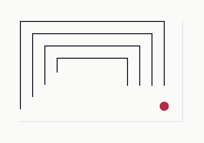
For cover panels and section transitions. Related to the Z’s linear construction, without redrawing the mark.
Download SVG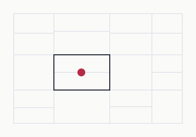
An abstract, non-geographic motif. Use on brand collateral, never as an implied cadastral map.
Download SVG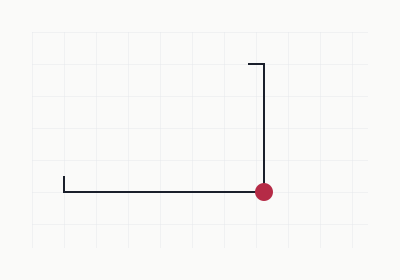
For spacious identity panels and empty decorative fields. Keep grid lines away from body text.
Download SVGUse an 8 px rhythm for layout, with 4 px increments for compact UI. Page gutters: 16 px mobile, 32–48 px desktop. Do not preserve desktop whitespace by squeezing mobile content.
Keep controls rectangular and architectural. Use circles for avatars and genuine circular controls; avoid turning every label and CTA into a pill.
Start with 12 desktop columns, 8 tablet and 4 mobile. Align text, media and controls. A clipped diagonal photo edge can be used in a roomy hero, remove it when it compromises the crop or mobile layout.
Use subtle borders before shadows. No glass panels, ornamental gradients or floating cards on every surface.
150 ms for simple feedback; about 220 ms for ordinary transitions. Animate opacity or transforms, not layout dimensions. Stop loaders when their work is finished.
Respect reduced-motion preferences. No perpetual logo pulses, autoplay parallax or motion that delays a primary task.
Buildings, homes and neighborhoods should look like themselves. A clear view is more valuable than an exaggerated promise.

Use credible light, natural color and legible architectural details. Include context at more than one scale: the property, its building or community, and its surroundings.
Preserve verticals without misrepresenting the space. Prefer calm compositions with room for a caption or neutral label.
Do not use unrelated architecture to represent a specific listing. Do not remove permanent defects, invent a view or enlarge a room with distortion.
Label renders, virtual staging and other materially altered imagery. Record usage rights and a source before publishing a photograph.
Keep a consistent crop within a results grid. Preserve the focal point.
A starting ratio, not a reason to crop out essential context.
Use the icon-only preset; keep platform crop previews in mind.
Use a consistent 24 px drawing grid, around 1.5–2 px strokes and optical alignment. Pair unfamiliar icons with text. Give every icon-only action an accessible name; hide decorative icons from assistive technology.
Use one icon family throughout an interface. Keep drawing weight, optical size and alignment consistent across controls.
Choose the arrow by what the action does. Use the same system in interfaces, illustrations and visual assets.
A vertical arrow points from top to bottom. Use it only to scroll or jump to content on the current page.
Read the accessibility notesA horizontal arrow points from left to right. Use it for same-site navigation and CTA actions that keep the current browser tab, such as opening a contact form or creating an account.
Explore interface componentsA diagonal arrow points from bottom left to top right. Reserve it for links or actions that open a new browser tab: usually an external website, or a same-site document such as a PDF.
Visit Zendi (opens in a new tab)Pair arrows with specific labels and hide decorative arrow icons from assistive technology. Identify new-tab behavior in the link’s accessible name, and use target="_blank" with rel="noopener noreferrer". The diagonal arrow always means a new tab; an external URL alone does not qualify.
Use clear labels such as “Download SVG” and “Copy HEX” for utility controls. The down arrow is reserved for page jumps. Arrows communicate navigation, so use words or punctuation for size ranges and step sequences.
This guide’s navigation opens distinct guideline sections in the same tab. A link that scrolls within the visible section is a page jump.
Cherry leads. Charcoal supports. Information stays neutral. Try the examples below; they never submit data to the live platform.
One primary task per group. Solid charcoal is the secondary CTA; neutral outlines are lower-emphasis alternatives. Use specific verbs rather than “Submit” or “Click here.”
Compare the location using the neighborhood guide before deciding.
Explore neighborhoodsUnderline body links at rest, including on touch devices. Use an anchor for navigation and a button for an action. Navigation menus can stay charcoal because their placement identifies them as navigation. Match every arrow to the navigation arrow system.
Opaque white with a charcoal outline for routine status; solid charcoal with white text for selected emphasis. A 1 px outline, 4 px radius and 12–14 px medium text are the baseline. No translucent pastel fills or red “For sale” badges.
Illustrative layout · not a live listingCommunity · Neighborhood · Municipality
3 bedrooms · 2 bathrooms · 120 m²
View property details“Verified” is evidence, not decoration. Define what was checked, by whom and when. Do not use it as a general promise that every part of a property or transaction is guaranteed.
“Featured” describes placement. It must not look like a verification claim. Label sponsored placement when applicable; do not invent endorsements.
Prefer two visible badges at most on compact cards. Keep badges clear of save buttons and useful photographic details.
Use persistent labels, readable placeholders and visible keyboard focus. An error explains the repair and uses aria-invalid plus descriptive text. Neutral feedback avoids confusing brand red with an error state.
Explain what is happening. Preserve layout and block duplicate requests.
No properties match these filters.
Try a nearby area or remove a filter.
Use explicit labels, explain consequences and request confirmation when warranted. Do not make users distinguish “Search” from “Delete” by a different red alone.
These interactive examples demonstrate the brand standards using sample data. Touch-target minimum: 44 × 44 CSS px for interactive controls; test keyboard, zoom and screen-reader behavior separately.
The map, the listing and the neighborhood context should help explain each other. None should be a decorative afterthought.
Property A selected in both views.
Use charcoal for ordinary price markers and cherry for the active selection, reinforced by an outline and selected state in the list. Keep labels readable and accessible without color.
On mobile, provide an explicit list/map switch while retaining filters and selection. A hover-only preview is not enough.
Municipality, barrio or vereda, and community are meaningful location concepts. Present the relevant path without forcing urban and rural places into a false universal hierarchy.
Label approximate locations. Do not display a precise point when only a neighborhood is known, or expose private location details without permission.
Pair a metric with its geography, time period, source and sample size where relevant. Distinguish asking prices from completed-sale data.
Use consistent units and explicit currencies. Explain conversions and estimates. Missing data is not zero; uncertainty is not precision.
Use neutral chart series and cherry for the selected comparison. Add direct labels, patterns or line styles rather than relying on many hues.
1. Orient. 2. Evaluate. 3. Investigate. 4. Act. Start with a credible title and location, imagery, price and essential facts. Follow with amenities, contextual information, source/verification details and an identifiable contact route.
Keep the photo gallery, feature facts, amenities, location and contact route easy to find. Do not remove meaningful data in pursuit of a cleaner screenshot.
Informed, calm and precise. Locally grounded and human. Confident about what is known; explicit about what is not.
Explain a place, a trade-off or a next step. Use plain words, specific facts and helpful labels. Ask for only the information the task needs.
No invented scarcity, guaranteed returns, unsupported superlatives or blanket verification claims. Avoid exoticizing Colombia or treating every foreign visitor as an investor.
Compare properties in the neighborhoods you are considering.
Unlock the ultimate paradise investment of a lifetime!
This location is approximate. Ask the listing contact for details.
Perfect location. Everything you need is right here.
We could not save your changes. Your entries are still here. Try again.
Oops! Something went wrong.
Compara propiedades en los barrios que te interesan.
¡La inversión de tus sueños en un paraíso sin igual!
La ubicación es aproximada. Consulta los detalles con el contacto del anuncio.
Ubicación perfecta. Aquí lo tienes todo.
No pudimos guardar los cambios. La información que ingresaste sigue aquí. Intenta de nuevo.
¡Ups! Ocurrió un error.
Preserve Medellín, Antioquia and local place names. Use appropriate terms such as barrio, vereda, finca, apartamento, conjunto or unidad residencial when they describe the actual place.
Do not translate administrative terms into a misleading equivalent. Define unfamiliar terms when helpful. Match the level of formality to the task; the examples here use a direct, approachable voice.
120 m² (1,292 sq ft) · COP 850,000,000
120 m² (1.292 pies²) · COP 850.000.000
Use m² for structures and small plots, hectares for large land, and kilometers for distance. Keep imperial conversions secondary. Do not imply price certainty when a value is estimated or converted.
Zendi helps buyers, sellers and real estate professionals make better-informed property decisions in Medellín and Antioquia through clearer listings, local context and practical tools.
Use the language toggle to compare English and Colombian Spanish copy examples.
Search 111 brand assets by destination, format or treatment. Choose the export that fits your placement.
Filter by Native app icons, then download the results ZIP to retain relative paths. The asset library includes Android adaptive resources and an iOS asset catalog; they are not compiled apps.
Read the native handoff notesPNG dimensions and padding describe the prepared export, not necessarily a platform’s required upload size. Always inspect the destination’s crop preview.
Download CSV index JSON indexUse the same tokens in the examples and the implementation. Keep the logo files intact and apply the standards consistently across every interface.
The canonical palette, semantic aliases, spacing, radii and motion values used by this site.
Download tokens.cssMarkdownA focused brief for design tools, with brand standards, accessible patterns and implementation requirements.
Download design.mdChecklistA practical checklist for applying the palette, typography, navigation and component standards.
Download implementation checklist:root {
--primary: var(--z-cherry); /* #B52B46 */
--primary-foreground: var(--z-white);
--secondary: var(--z-charcoal); /* #1A1F2B */
--secondary-foreground: var(--z-white);
--foreground: var(--z-charcoal);
--background: var(--z-warm-white); /* #FAFAF9 */
--border: var(--z-soft-gray); /* decorative */
--input: var(--z-slate); /* functional edge */
}These are CSS color values, not HSL channel lists. Check the consumer before pasting into a different Tailwind or component-system version. Do not globally turn every accent surface into a cherry fill.
Check contrast in each state, keep body links underlined and provide visible focus. Use real headings, labels, buttons and anchors. Keep focus and text unobscured.
Test keyboard navigation, reduced motion, 200% zoom, narrow layouts and screen-reader names. Do not treat a passing contrast table as proof that the entire experience is accessible.
This guidelines site is static HTML, CSS and JavaScript. No build step, API keys, login, database or analytics are required. Image exports use stable, direct download paths.
Inter is requested from Google Fonts with system fallbacks. The architectural photograph is served from Cloudinary. No font files are packaged.
Maintenance and deployment notesThis checklist is local to the page and is not saved or transmitted.
Apply these standards wherever Zendi appears, from a profile image to a complete product experience.
| Element | Standard | Use |
|---|---|---|
| Identity | Original Z geometry and lettering | Use the supplied masters with clear space; keep proportions and the locator dot intact. |
| Color | Cherry, charcoal and neutrals | Cherry leads actions; charcoal anchors text and secondary actions; neutral space supports information. |
| Typography | Inter throughout | Build hierarchy with the responsive type scale, weight and spacing. |
| Geometry | Architectural lines and an 8 px rhythm | Use the shared spacing, corner and pattern specifications. |
| Navigation | Arrows describe the destination | Down for a page jump, right for same-tab site navigation or a CTA, diagonal for a new tab. |
| Voice | Informed, calm and precise | Use clear facts, local context, explicit currencies and metric-first measurements. |
Use the same logo masters, color tokens, typography and arrow meanings across websites, product interfaces and brand collateral. Keep text links recognizable and interactive controls accessible.
Preserve property facts, location context and clear next steps. Support verification claims with evidence, and label illustrative content, estimates and approximate locations accurately.
